





Today's digital marketplace is less a stationary catalogue and more a high-stakes negotiation. To drive sales, your e-commerce hub must go beyond displaying products and require a thoughtfully designed experience engineered to help visitors, frequently sceptics, with a comparison tab, smoothly travel to the "Purchase" button. Emphasis on the features that build trust, ease of navigation, and the elimination of checkout barriers are not optional—they are tantamount to high conversion ratios.
I. Essential Conversion-Driver Features: The Non-Negotiables
These core building blocks will hold your digital house together so you don’t collapse under the weight of abandoned carts.
Navigating and Searching: Reducing the Demand on the User’s Cognitive Load
The user’s primary task is to discover an item. Any friction or impediment will lead to frustration, which is now a lost sale.
Obvious Categorisation: Picture your categories as directions. If it takes a user more than three clicks to find something, you have put up an information wall. Categories need to be descriptive, but put into groups so that they logically connect. Rather than simply "Shoes," think "Men's Shoes > Athletic > Running."
Strong Search Functionality: A search bar is essentially a fast pass for users with high intent; it should include predictive autocomplete--offering product or category suggestions as the user types. Consider your webpage as intelligent - it not only tolerates small misspellings (sneakers vs. snakers), but it also allows users to quickly sort and filter results based on price or colour - enabling a fast and painless search for the desired item.
High-Quality Product Pages
This page has the full burden of proof because the customer can't actually touch the item; therefore, your page needs to provide better digital proof.
Convincing Visuals: Static, low-resolution images are detrimental to your brand. Use multiple, crisp, high-resolution images from all the important angles and include different types (360-degree views) and preferably product videos that both provide context and show the product being used. This provides some level of tactile connection.
Describing with detail & in a benefit-driven way: Don’t make the mistake of merely listing the technical specs. Specification is important, but make sure the descriptions are persuasive. Features should be expressed according to customer benefits.
Social Proof (Reviews & Ratings): Be sure to highlight the star rating that averages overall ratings within the overall product title. In addition, the system should make it easy to leave a new review and, most importantly, allow users to filter reviews (for instance, "show me reviews by verified buyers," or "show me reviews that mention 'fit'").
Simplified & Transparent Checkout Process:
This is the area where most costs are lost. Every extra field, every surprise charge, is a chance for the customer to leave.
Guest Checkout: Requiring registration is an all-powerful move that punishes convenience. Implement guest checkout and do it immediately. You can always ask the customer to register once the order is confirmed and frame the advantages of registering ("Create an account to easily track your order!").
Progress Sign: Combat abandonment anxiety with a clear visual. This helps to provide cognitive closure and can assure the user that the process will have an end and that they will be able to manage that.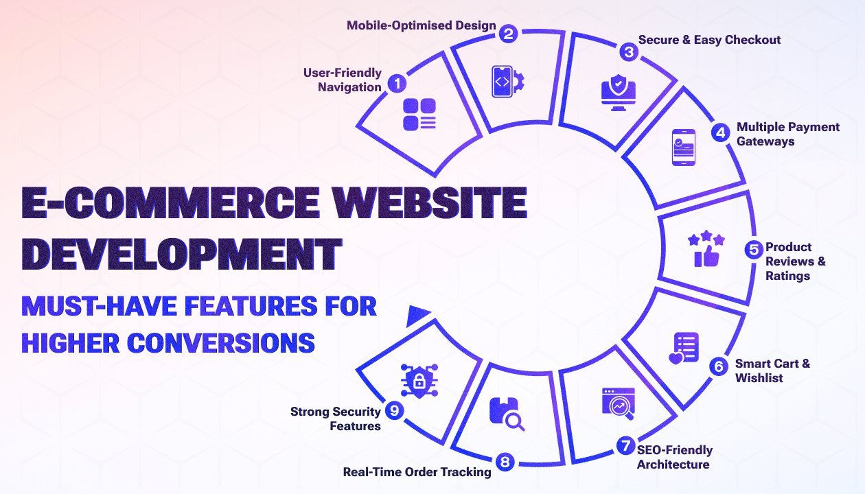
Full Cost Visibility: An unforgivable sin in e-commerce is the late disclosure of surcharges. Shipping costs, handling charges, and taxes should be calculated and shown to customers as early as their cart summary—ideally in some form, even on the product page, through some kind of zip code estimator. Stealth costs will instantly destroy trust.
Trust Signals and Security: Building the Confidence Canopy
Customers have to feel confident about the security of their sensitive information and that the purchase is safe.
SSL Certificate: This is the minimum, visually demonstrated in the padlock icon and the https:// prefix. Consider it as the confirmation of your information being encrypted.
Trust Badges: Show the logos of payment gateways (Visa, Mastercard, PayPal, Apple Pay). Include badges from recognised security verification services prominently displayed as well. This functions as an external validation stamp.
Mobile-First Design (Responsiveness):
As mobile devices often make up the bulk of browsing traffic, your site can’t just “work” on a phone—it has to perform.
Optimisation: Test, test, test. Buttons need to be big enough to be friendly for fingers (large tap targets), and form fields need to take advantage of the mobile keyboard (e.g., numeric keyboard for phone numbers). And slow load times are fatal on mobile, where users generally don’t have the same connectivity.
II. Optimisation for Friction Reduction: Removing Speed Bumps
These features will help increase the flow created by the base features.
High-Contrast CTAs: Your CTAs should be visually salient! Your CTAs should be high-contrast visual elements relative to the background. The language should also involve verbs such as "Buy Now" vs. the passive "Submit."
Clear Inventory Status: Ethically use scarcity to your advantage. When an item says, "Low Stock (Only 3 Left!)" the scarcity heuristic is activated and the user is ready to make decisions faster. Whereas, if an item says, "Sold Out", it allows the user to avoid the frustration of attempting to add it to their cart.
Simple Return / Shipping Policies: Lack of clarity breeds uncertainty. Links to policies cannot go unnoticed on the product page and site footer. A long, clear return window helps alleviate perceived risk in the purchase.
Persistent Cart Icon: The cart is a safety bubble for the user. The cart must be sticky (the user must see it and have access to it in the header on every page) and have an accurate item count at all times.
Conclusion
Creating a website is not about following a formula; it is about carefully honing the journey of your customer. You have to make a digital experience characterised by hyper-speed, insightful communication, and unambiguous trust. When you get things right like effortless navigation, pricing without hidden fees, beautiful product images, and a mobile and easy checkout process, you turn "maybe" into "buy." Suave Creators offers the best E-commerce development services. Let’s build something innovative together.